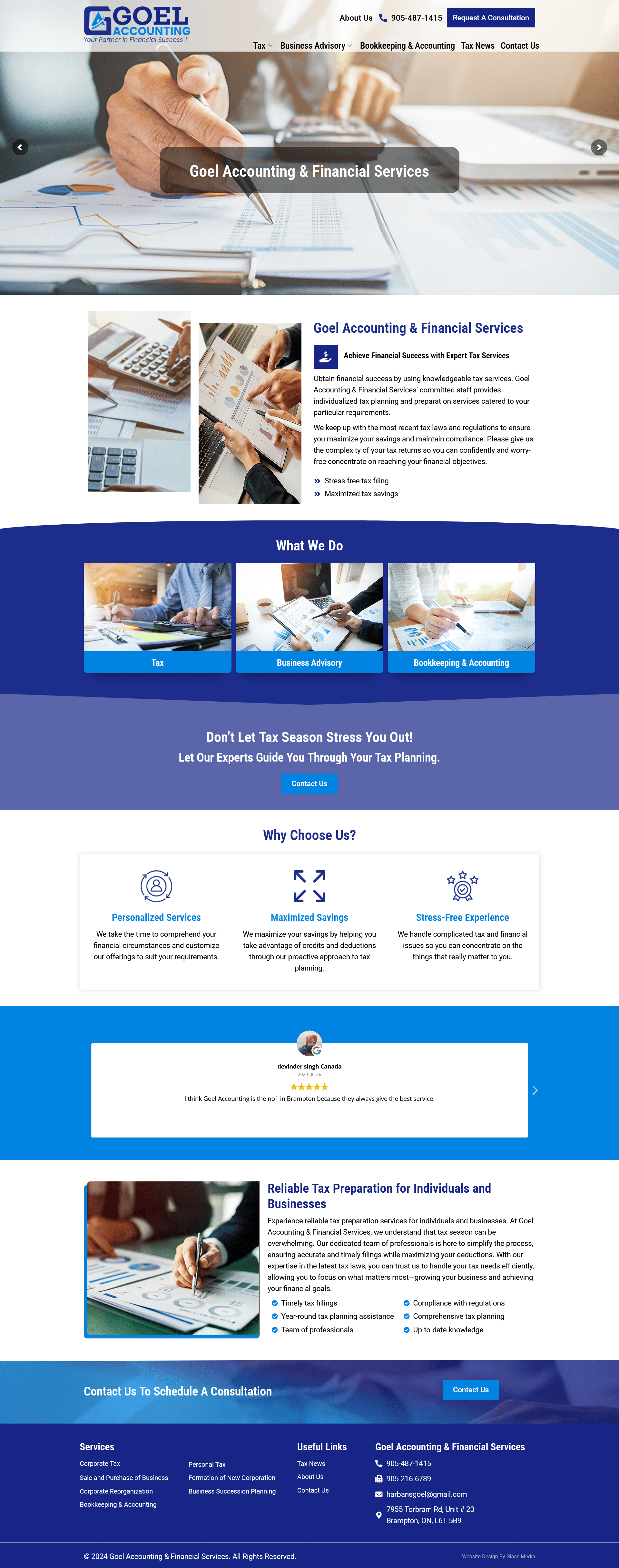
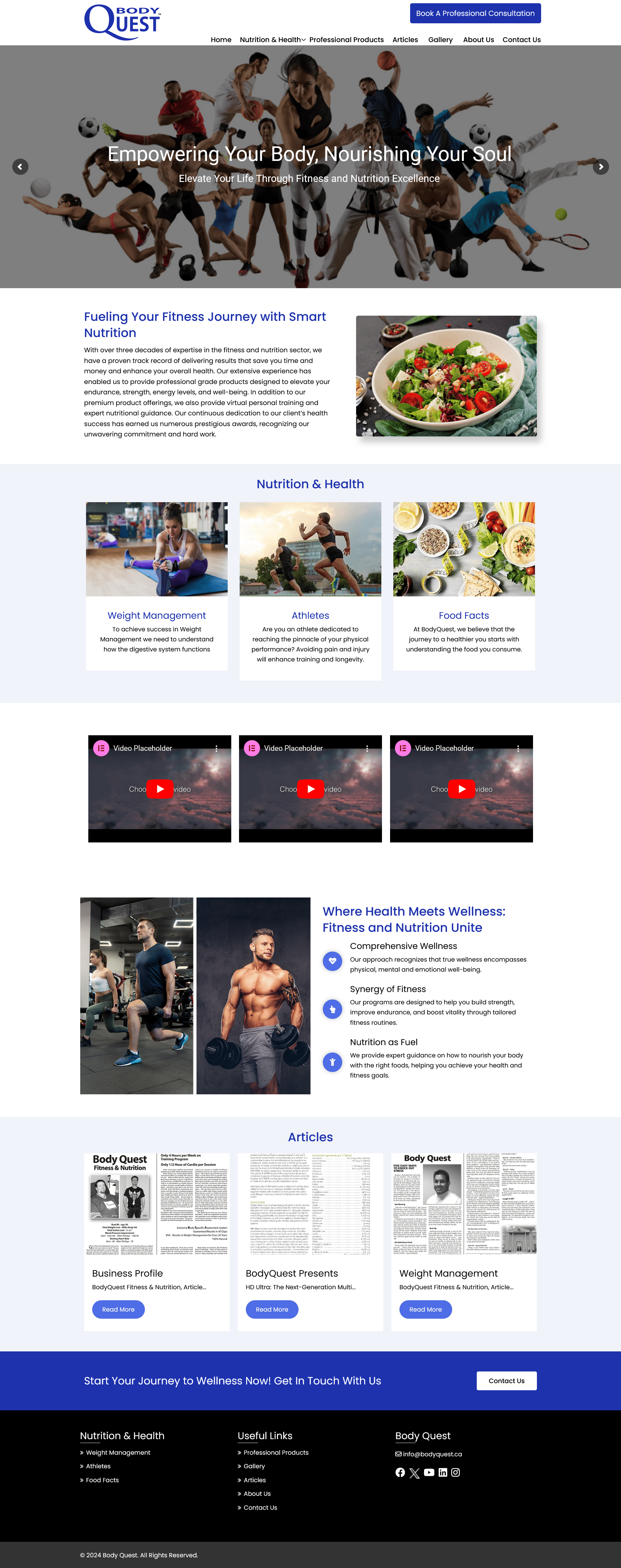
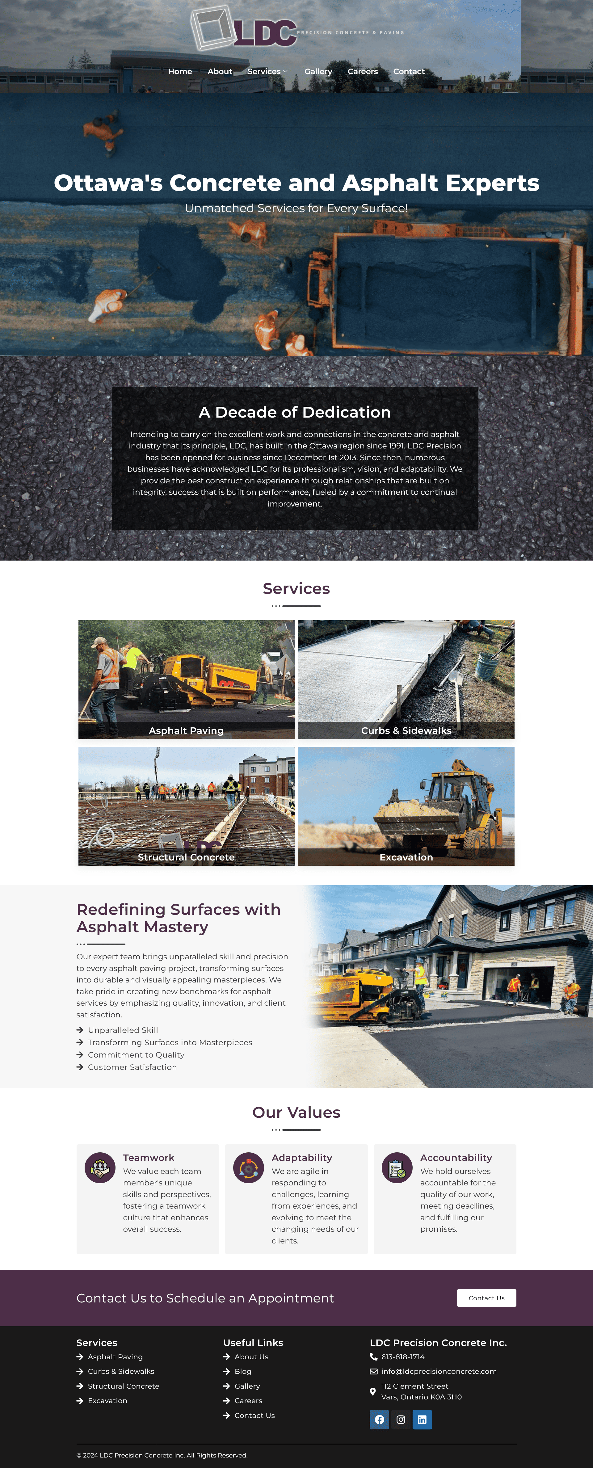
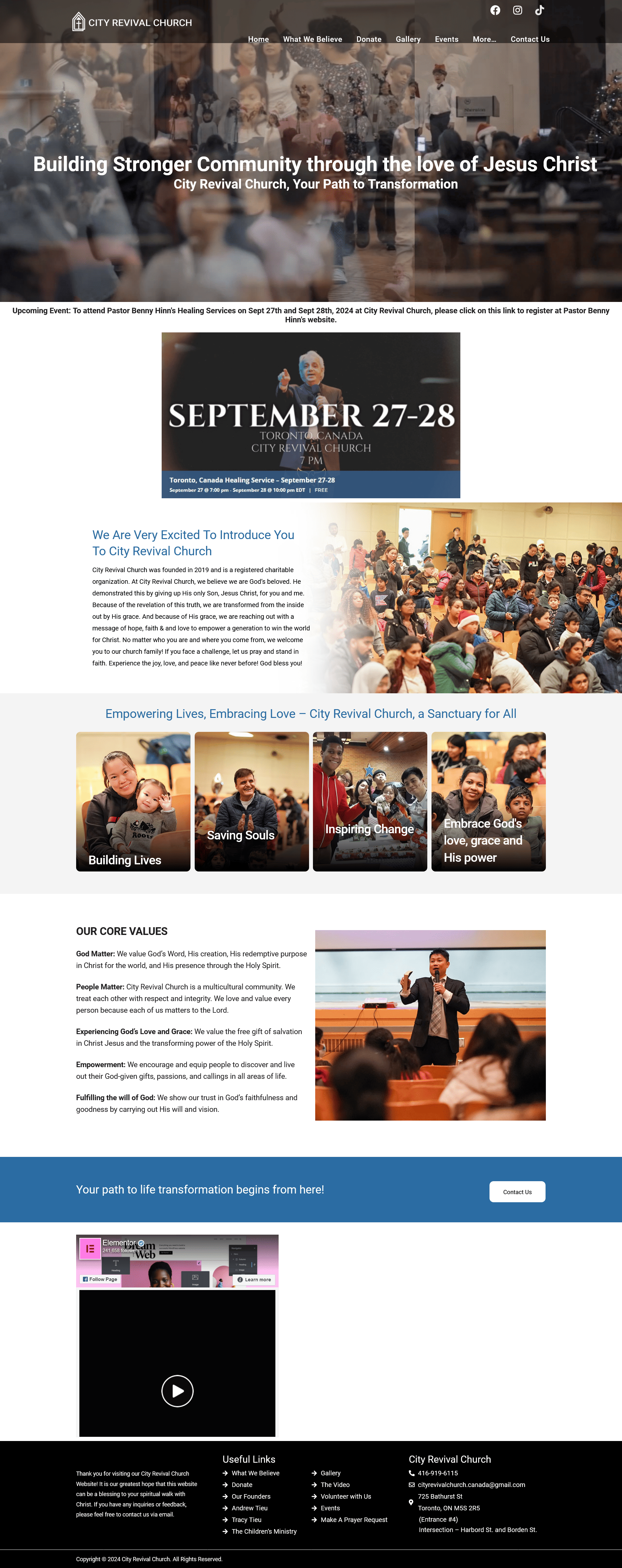
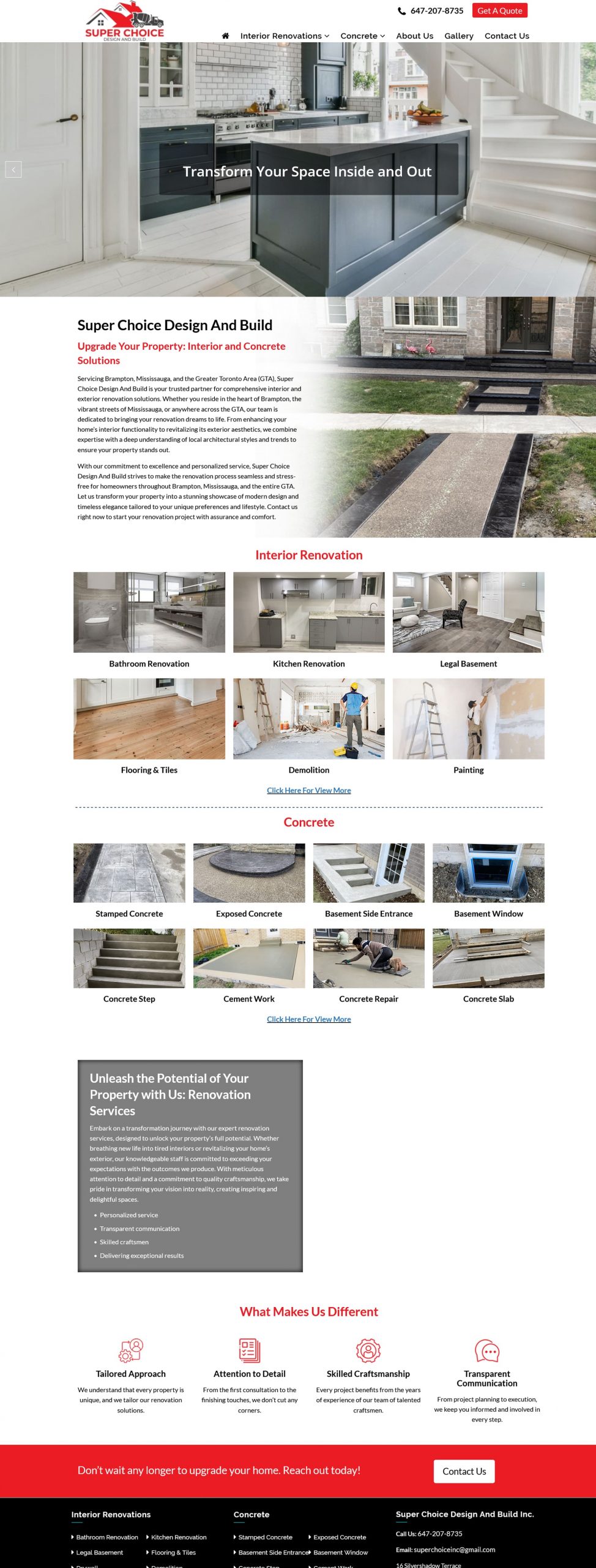
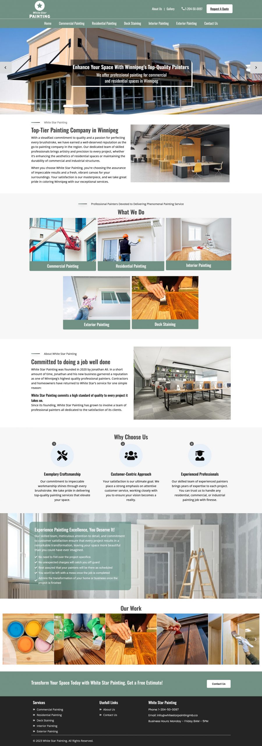
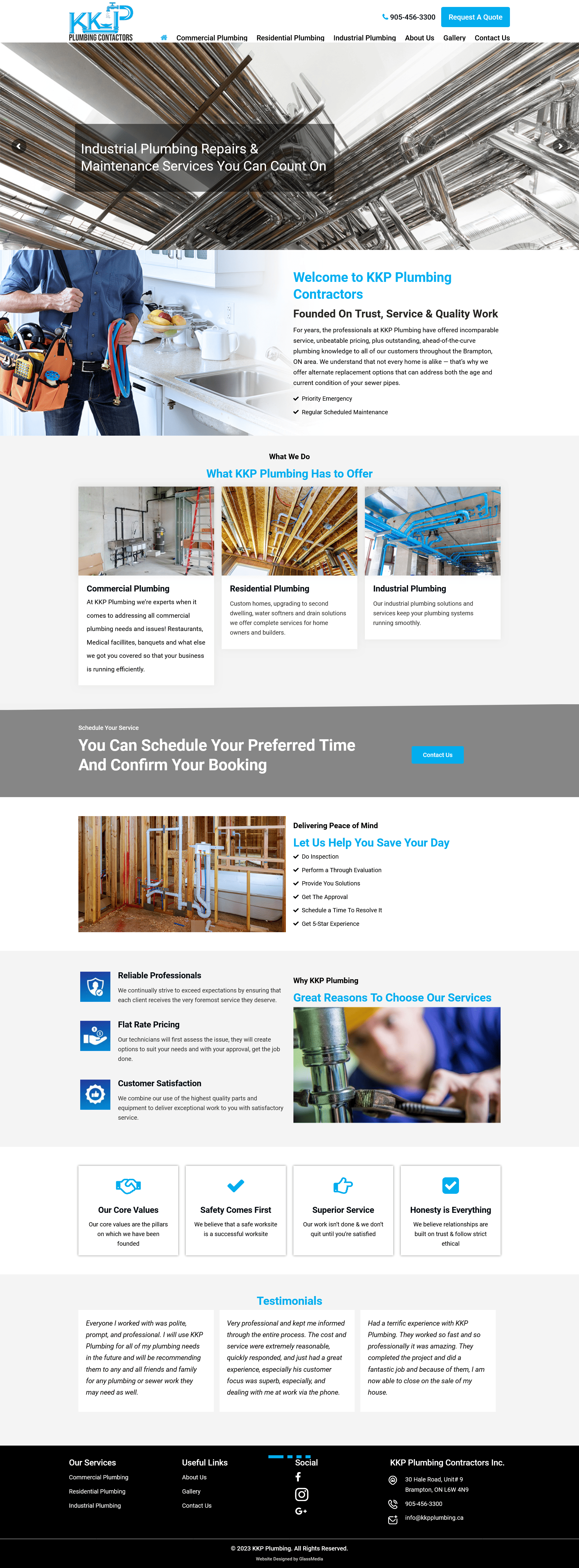
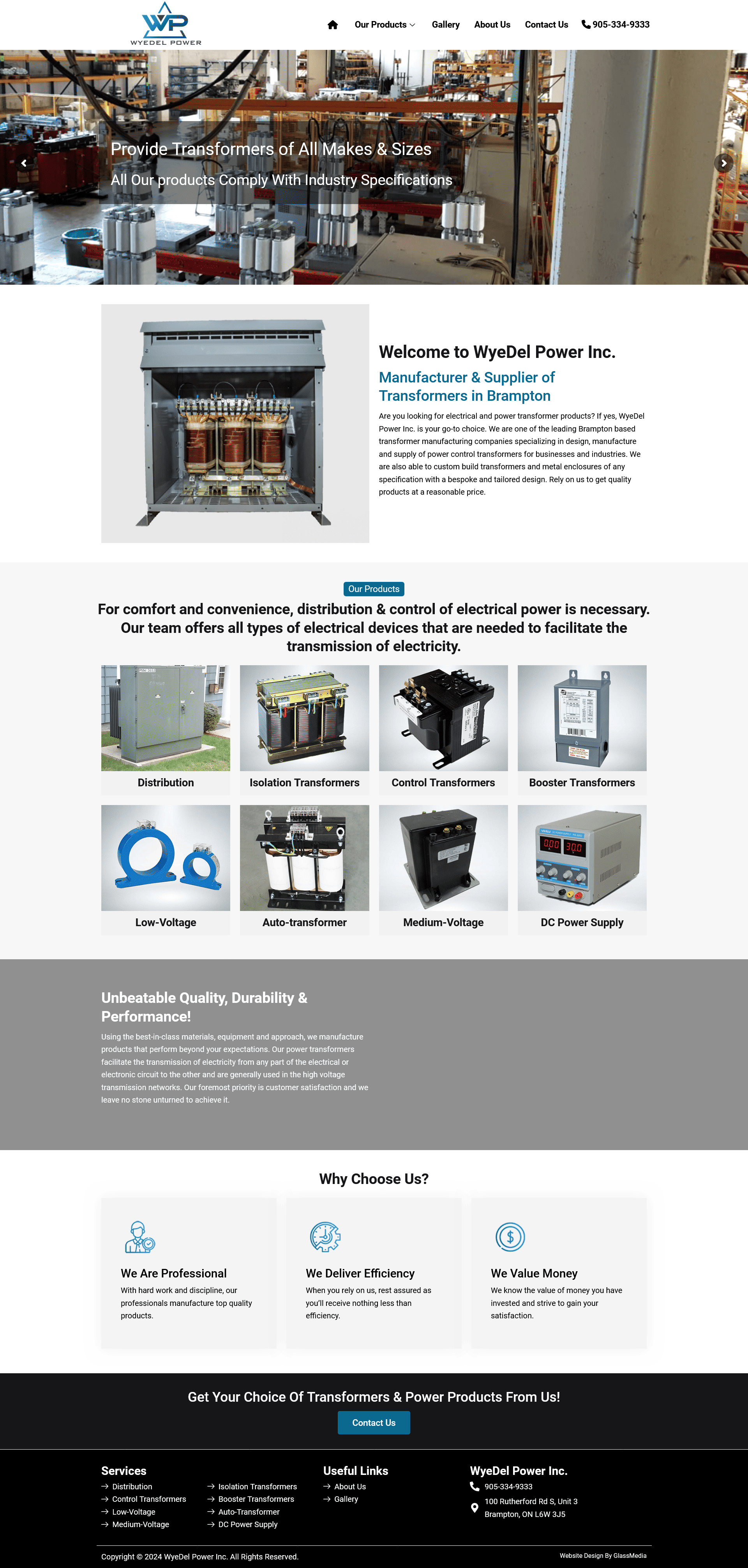
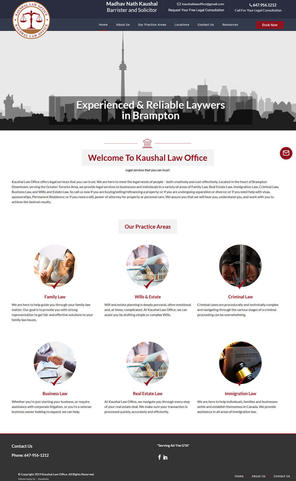
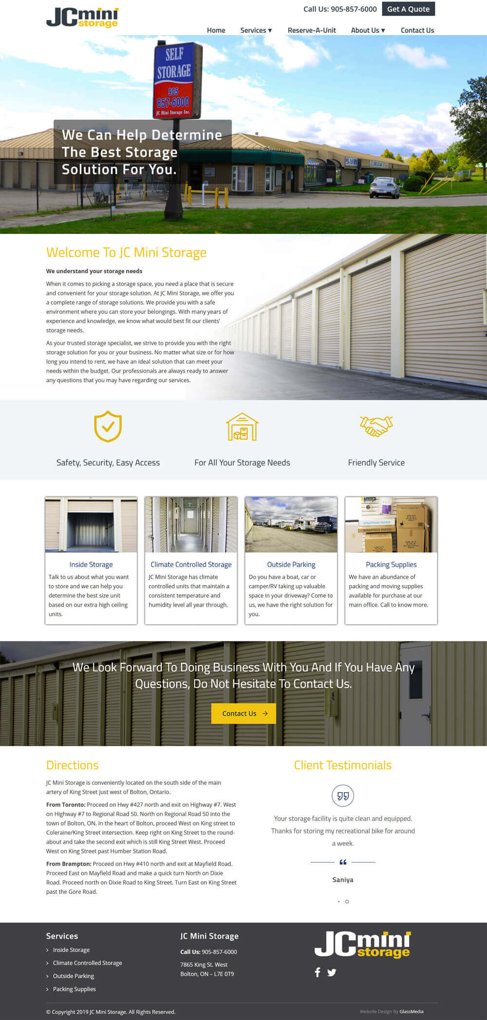
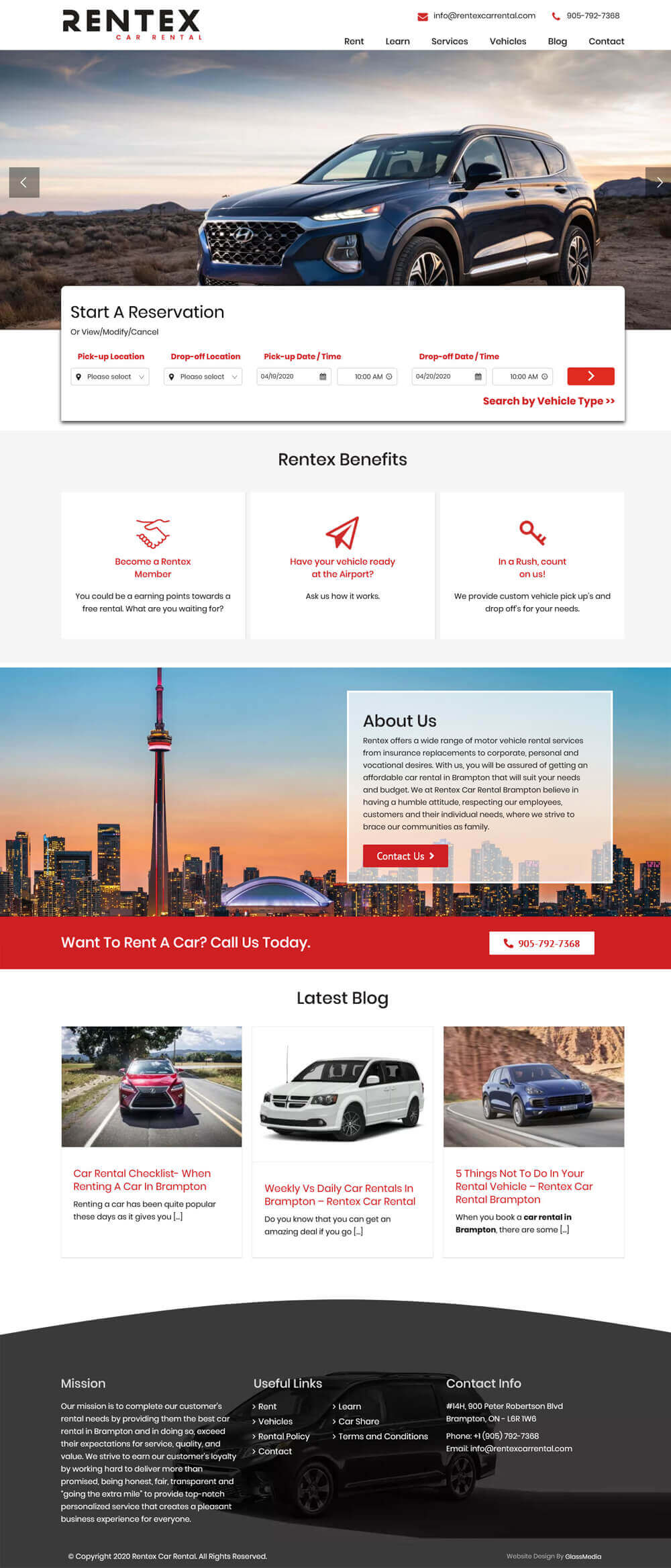
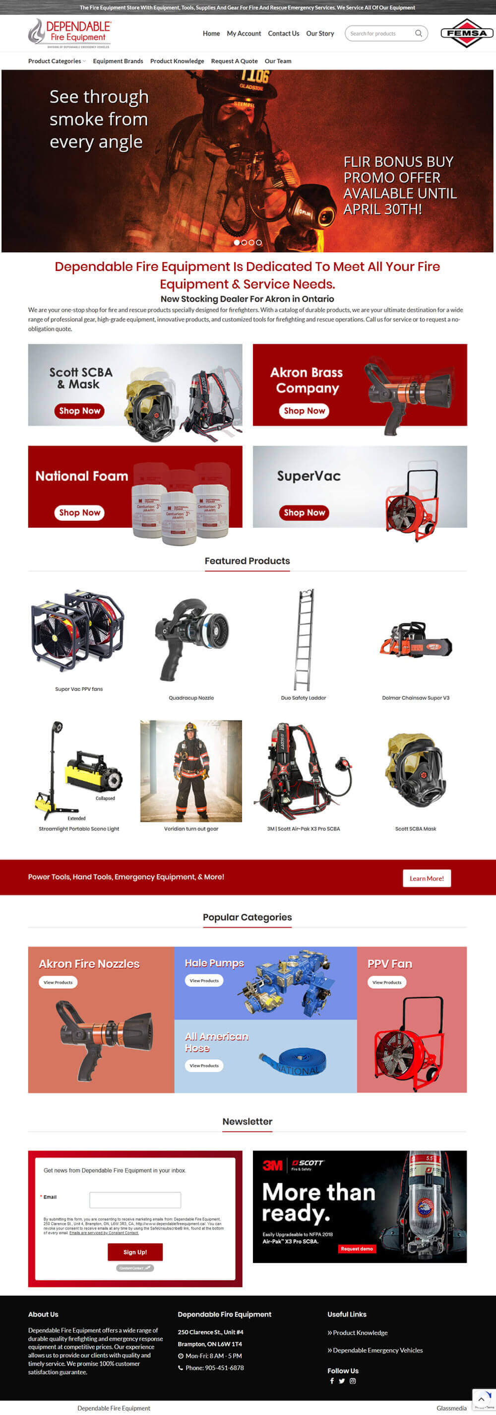
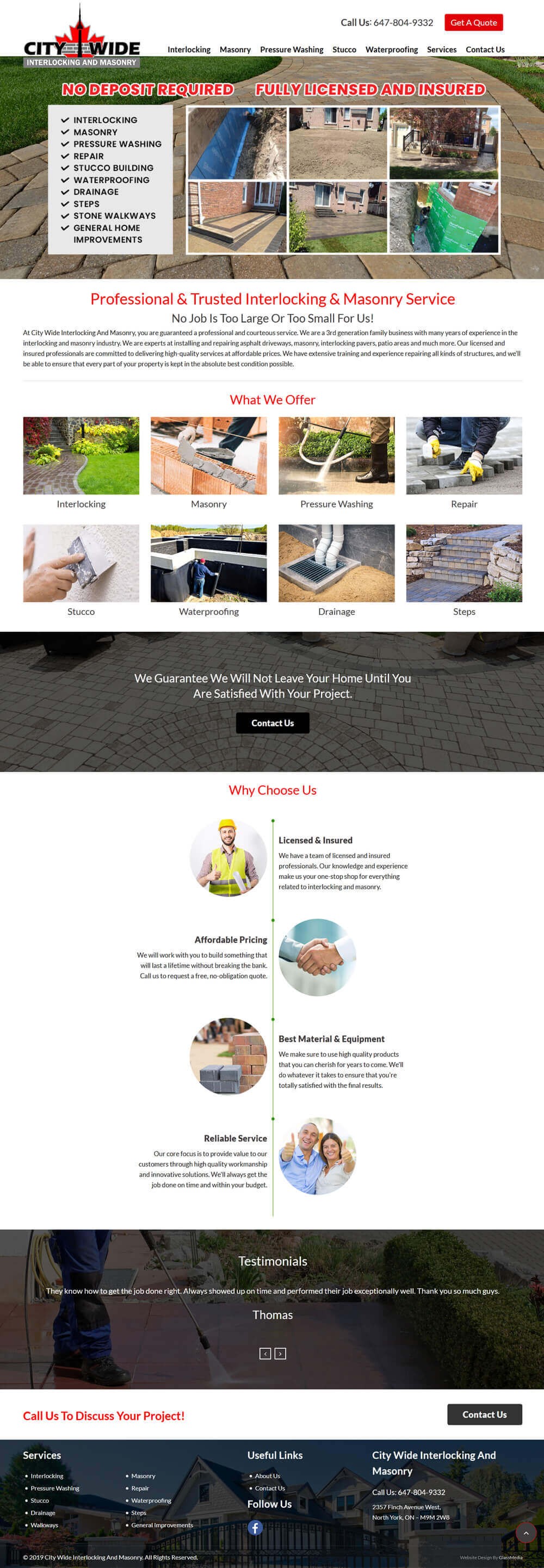
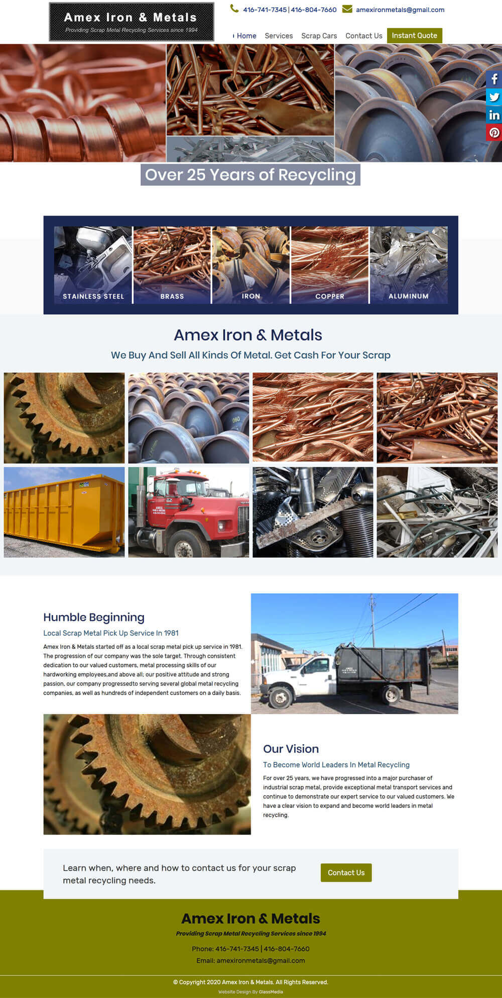
Having an online business presence is only worth if your website is attracting more and more audience towards itself. An attractive and innovative web layout somehow decides the success or failure of a brand. A dull and boring site fails to impress clients and therefore, lags behind in converting sales and leads. To make sure that your online face satisfies the recent design trends, it important that you should be aware of the latest design terms and approaches. In this way, you’ll be able to convey your requirements to the web designer in an effective manner.

Some of the terms of designing world that you should know are:
-
Typography
Typography, as the name suggests is a term related to typed characters, no matter, they are words, alphabets, symbols or even spaces. The font size, font color, and the arrangement of words is all decided by typography you selected. Make sure the one you chose is easy to read and understand by potential visitors.
-
Alignment
Alignment refers to the method of organizing elements or text in an order. In terms of design, it refers to the balancing of design, border & layout so that everything on the site is in a proper form. Stick to a pattern, and stay consistent to create something that is visually appealing.
-
Grid
One of the recent design trends that are favored by a majority of expert web designers is a framework that is evenly divided into rows and columns, also known as the grid. Nowadays, grids are in more usage as they provide cleaner and consistent way to align and arrange elements. They are responsible for making content more digestible by separating and organizing it in sections.
-
Resolution
Most of you might be known to what resolution is. It refers to the number of dot pixels in an image. Higher the image resolution, good is the picture quality. Posting high resolution images have a lot to do with user conversion. By uploading unique and high definition images, one can grab user attention and make them believe that your business is a reputed one.
-
Saturation
The depth of the colors depicted on a website plays a good role in improving its looks and appeal. Color saturation involves the degree of color intensity and vividness. If you want pale or cool looks, keep the ratio of saturation low. In contrast, if you want a bright and vibrant website, keep the saturation level high.
These are some basic designing terms that should be known to everyone. If you are looking to redesign your existing website with unique web layout and graphics, feel free to contact our talented Brampton web designers at GlassMedia.
- Tags:
- Designers ,
- Web Design ,
- Website Design

